Primary Color Palette
C:100 M:45 Y:0 K:10
Pantone 2945 C
USAGE: Main buttons, CTAs, Text links
C:70 M:10 Y:0 K:0
Pantone 2925 C
USAGE: Global navigation elements, Drop down arrows, Dynamic actions, Hover states
C:70 M:0 Y:100 K:9
Pantone 362 C
USAGE: Pricing (PP, TCO, incentives, calculators), Lead buttons, Special Offers
C:0 M:10 Y:100 K:0
Pantone 109 C
USAGE: Specs and info, Browse by, Research, Compare vehicles, Features
C:0 M:61 Y:97 K:0
Pantone 158 C
USAGE: Research, Secondary buttons, Inventory and results, Ratings listing
C:0 M:100 Y:79 K:20
Pantone 187 C
USAGE: Editorial, Buying guide, Auto shows
C:0 M:97 Y:100 K:0
Pantone 485 C
USAGE: Message and form errors, negative actions, etc.
C:33 M:3 Y:0 K:90
Pantone 433 C
USAGE: Page headers, Main body copy
C:23 M:2 Y:0 K:77
Pantone 432 C
USAGE: Section headers, Secondary editorial, Social, Car news, Best cars list
C:5 M:0 Y:0 K:45
Pantone 430 C
USAGE: Global navigation drop down
C:3 M:0 Y:0 K:32
Pantone 429 C
USAGE: Main Dotted and Solid hairlines
C:2 M:0 Y:0 K:18
Pantone 428 C
USAGE: Container Stroke and Solid hairlines
C:0 M:0 Y:0 K:11
Pantone 427 C
USAGE: Background colors, Buttons
C:0 M:0 Y:0 K:11
Pantone 427 C
USAGE: Background colors, CTAs
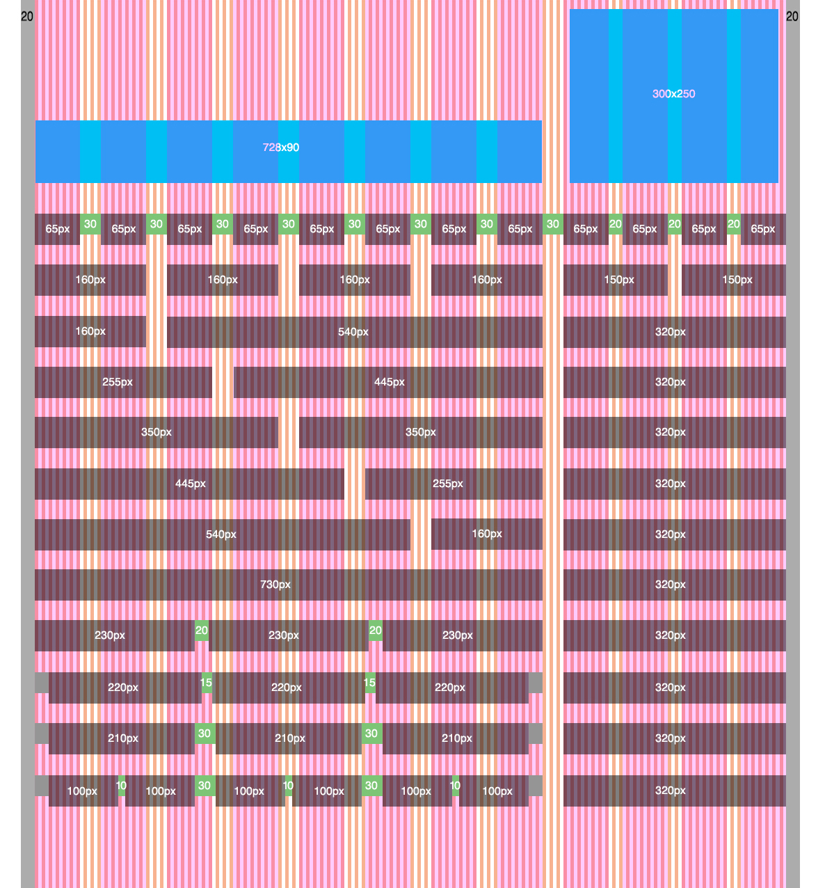
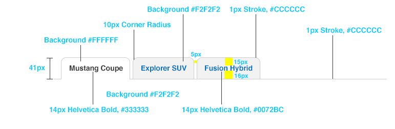
1080 Custom Grid System
This custom grid was developed to support our 2015 ad footprint where we introduced all IAB standard ad units (Leaderboards 728x90 and Medium Rectangles/Box Ads 300x250). Margins were added on either side of the grid for the purpose of protecting our pages from the occasional custom wallpaper ad or browser edges.
When designing to the grid just remember that everything needs to be horizontally divisible by 5 pixels, so no 37px gutters.
Type Sample
This is a an example of an H1
Helvetica, font size: 28px, Line height: 34px, #333333
Primarly used for page headers (e.g. H1)
This is an example of an H2
Helvetica, Regular, font size: 22px, Line height: 30px, #333333
This is an example of an H3
Helvetica, Regular, font size: 16px, Line height: 22px, #555555
This is an example of an H4
Helvetica, Bold, font size: 14px, Line height: 19px, #333333
This is an example of Body Text. Until recently, buyers in this category had two options: the BMW 3 Series or something that wasn't as good as the BMW 3 Series. But times have changed and BMW's spot at the top of the pecking order is as unstable as it's ever been. The base engine is now a turbocharged four-cylinder, and challengers to the throne are getting exceptionally good.
Helvetica, Regular, font size: 14px, Line height: 20px, #333333
Link 1
Helvetica, Regular, font size: 14px, Line height: 20px, #0072BC
Links lists: 14px/28px/24px line wrap
• Sed rutrum est non
• Duis dapibus viverra
• Suspendisse potenti
• Nulla quis enim ut elit
• Vivamus venenatis orci
Helvetica, Regular, font size: 14px, Line height: 20px, #333333
Nam mattis adipiscing tortor; sit amet porta massa tincidunt sit amet.
Helvetica, Regular, font size: 13px, Line height: 18px, #555555
*Nam mattis adipiscing tortor; sit amet porta massa tincidunt sit amet.
Helvetica, Regular, font size: 11px, Line height: 16px, #555555
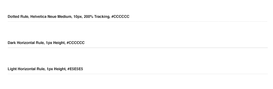
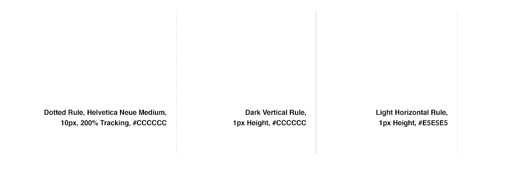
Horizontal Rules
Logos

Iconography
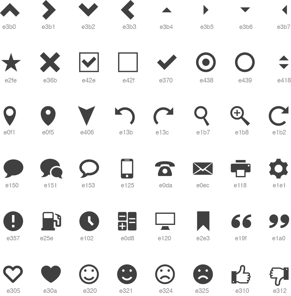

• 3 max colors (plus white or knockout) to align with flat UI
• Colors are within the Edmunds palette (or shade of - 25%, 50%, 75%)
• Illustrations are flat, no drop shadows or depth
• Concepts should be a metaphor for associated content
Buttons


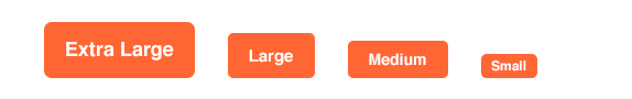
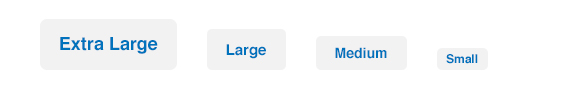
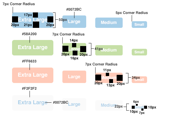
• Buttons with more than 3 word CTAs becomes a text link
• CTAs are always Upperlower Case
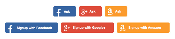
Social Buttons

Containers
Modal Windows
Forms
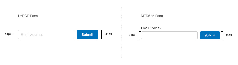
• All form fields should match button height
• Unselected form fields are contained by 1px rule, #cccccc
• Selected form fields are contained by 1px rule, #00aafd (secondary blue)
• Errored form fields are contained by 1px rule, #ff1929 (alert red)
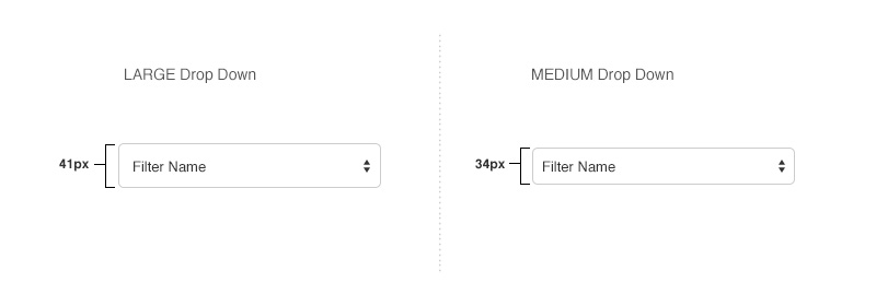
Drop Down Menus
Video Players
• Videos players should be designed without a container
• Sizes should be 16:9 ratio for full width of Main Well and Ad Well
• Main Well video size = 730x410
• Ad Well video size = 320x180
• Video thumbnail is customizable and should be saved at 730x410 to respond for all sizes
• Video active color = Secondary Blue, #00aafd
• The player is in pre-launch so our FED team is customizing the UI per Video team needs
• Once ready we will launch in right rail, content pages & photo flipper
• New player is responsive and adaptive, and we can edit CSS

Global Navigation

• Links are separated by slashes not carets
• Breadcrumb is set to 14px font size, #0072BC
• Selected links change color to #333333
• Share this Page toggle matches style & aligns with same baseline as breadcrumb
• Share buttons are standard social API shares
Global Footer